Problem:
There are no contemporary packaging solutions for traditional regional drinks like this one. The category is stuck in dated folk visual clichés that fail to interest a modern buyer.
Solution:
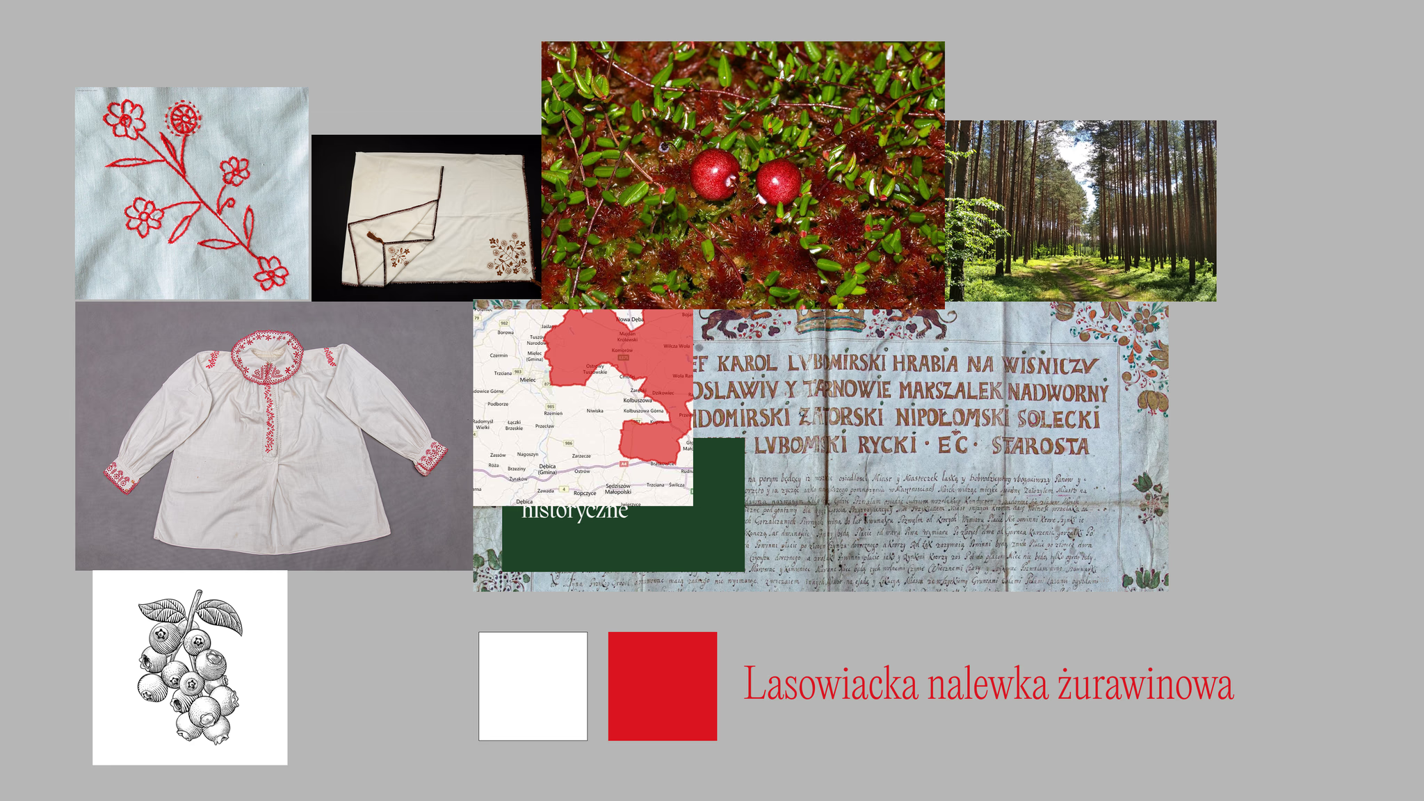
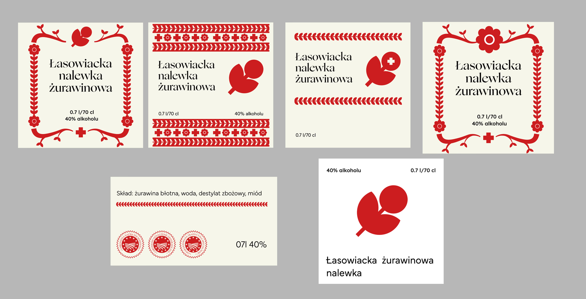
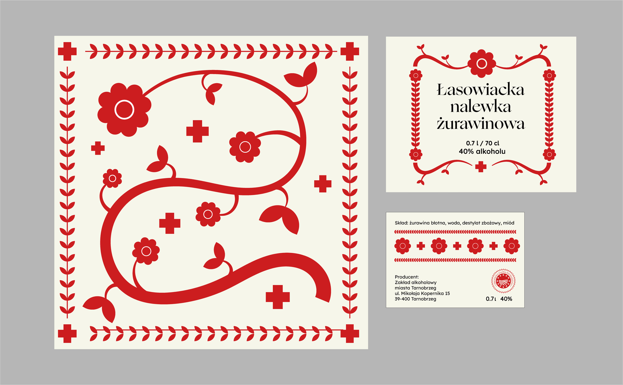
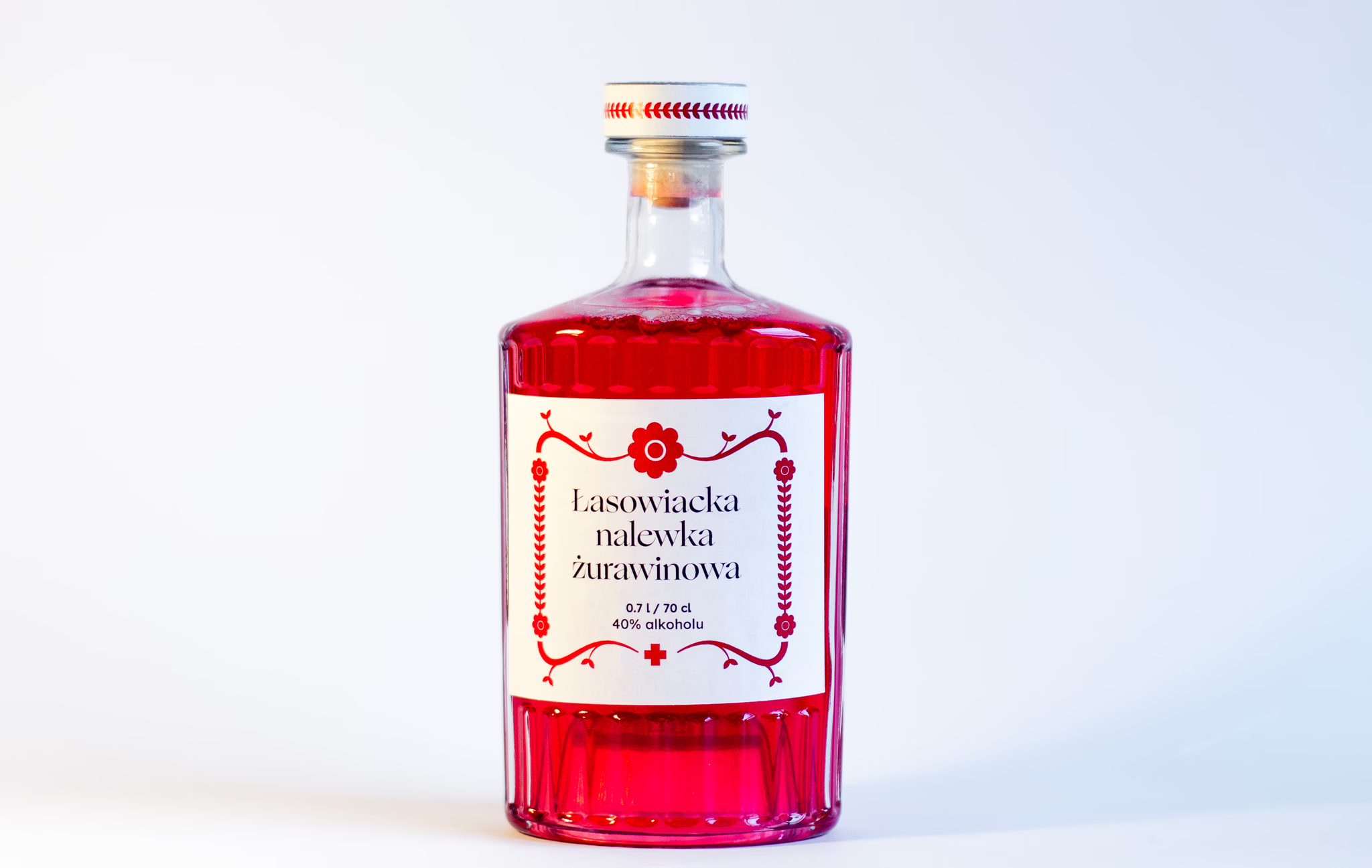
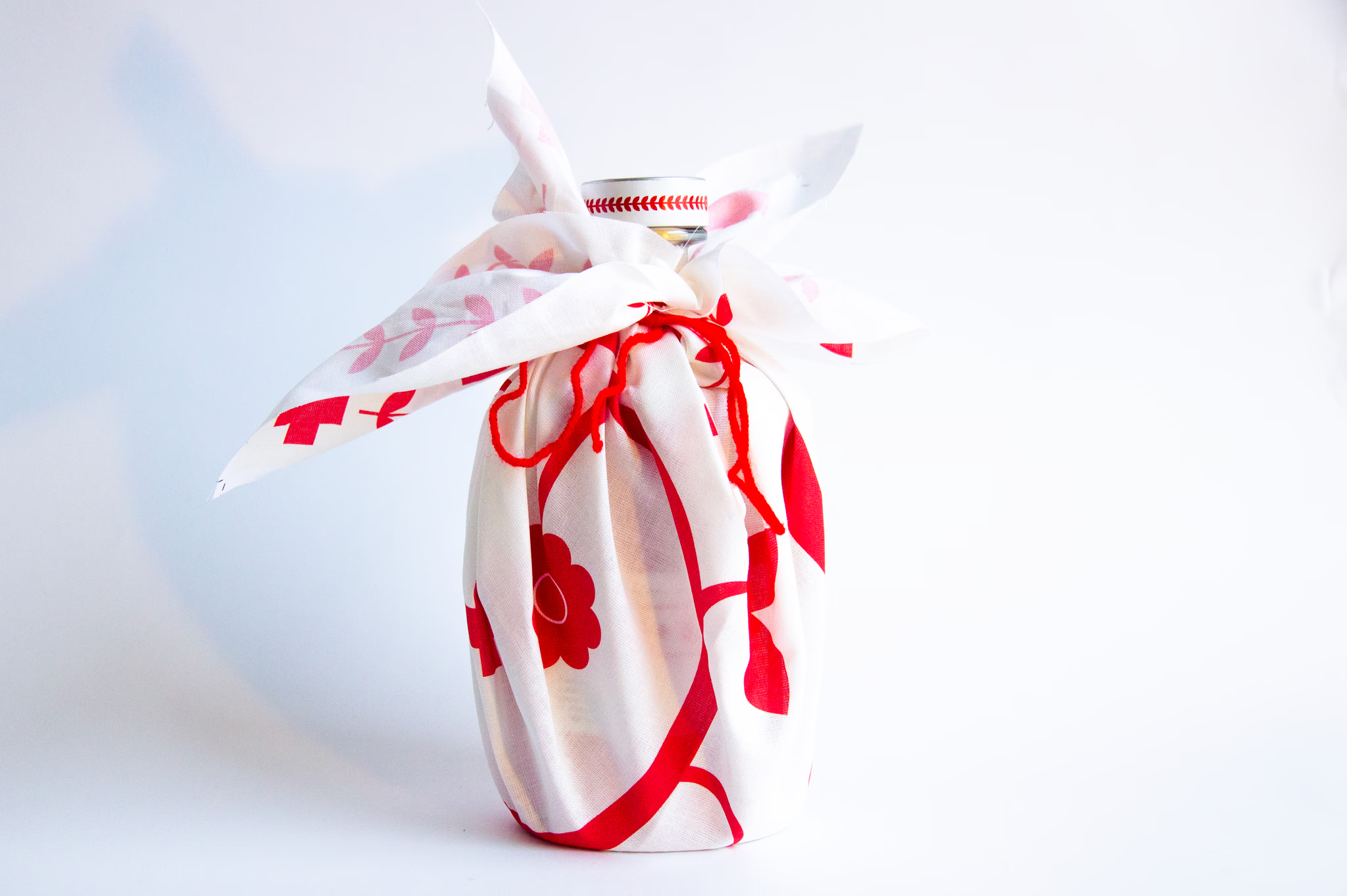
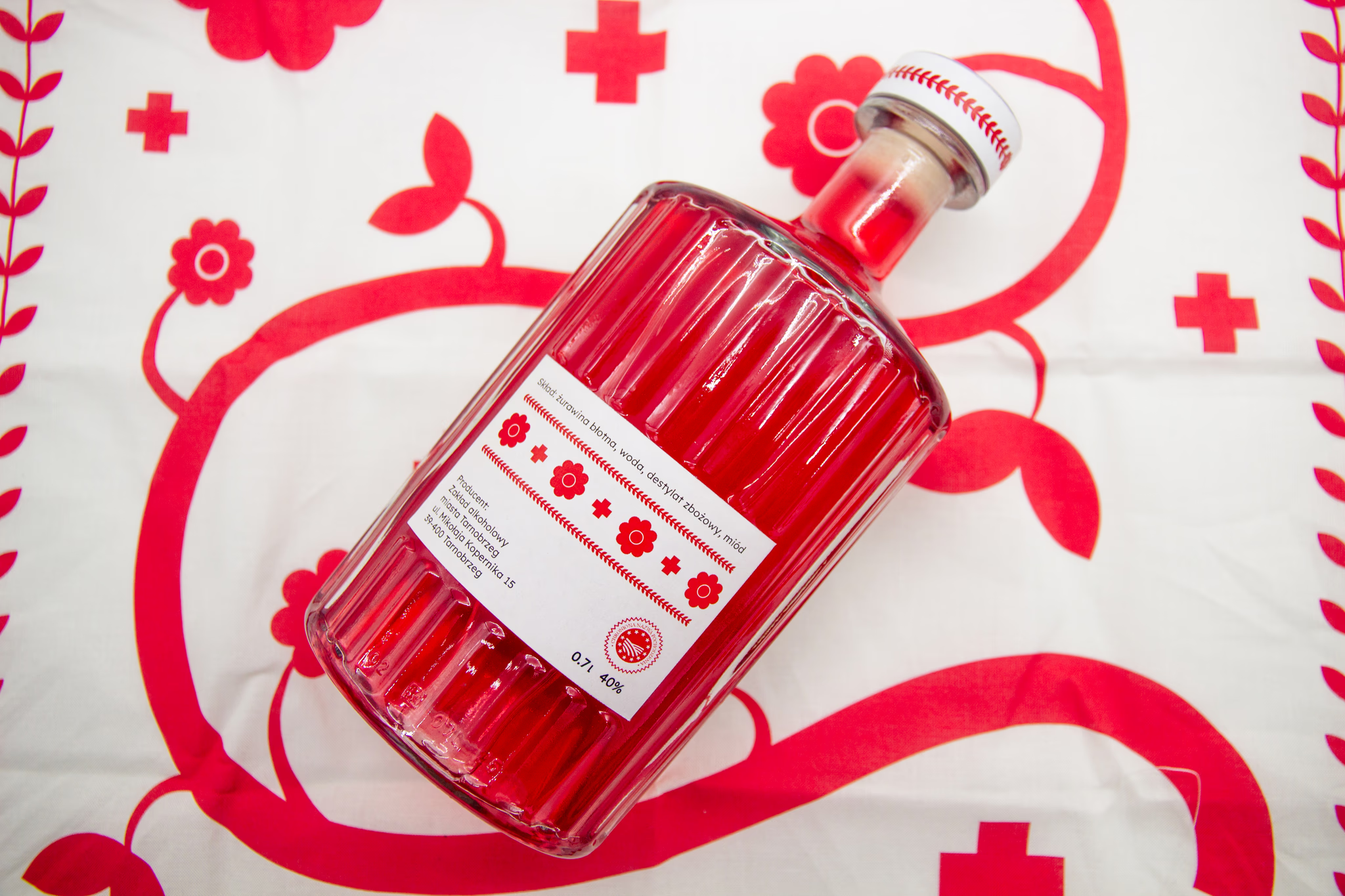
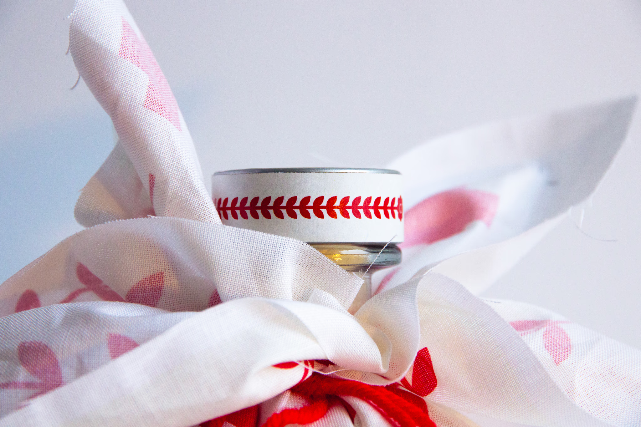
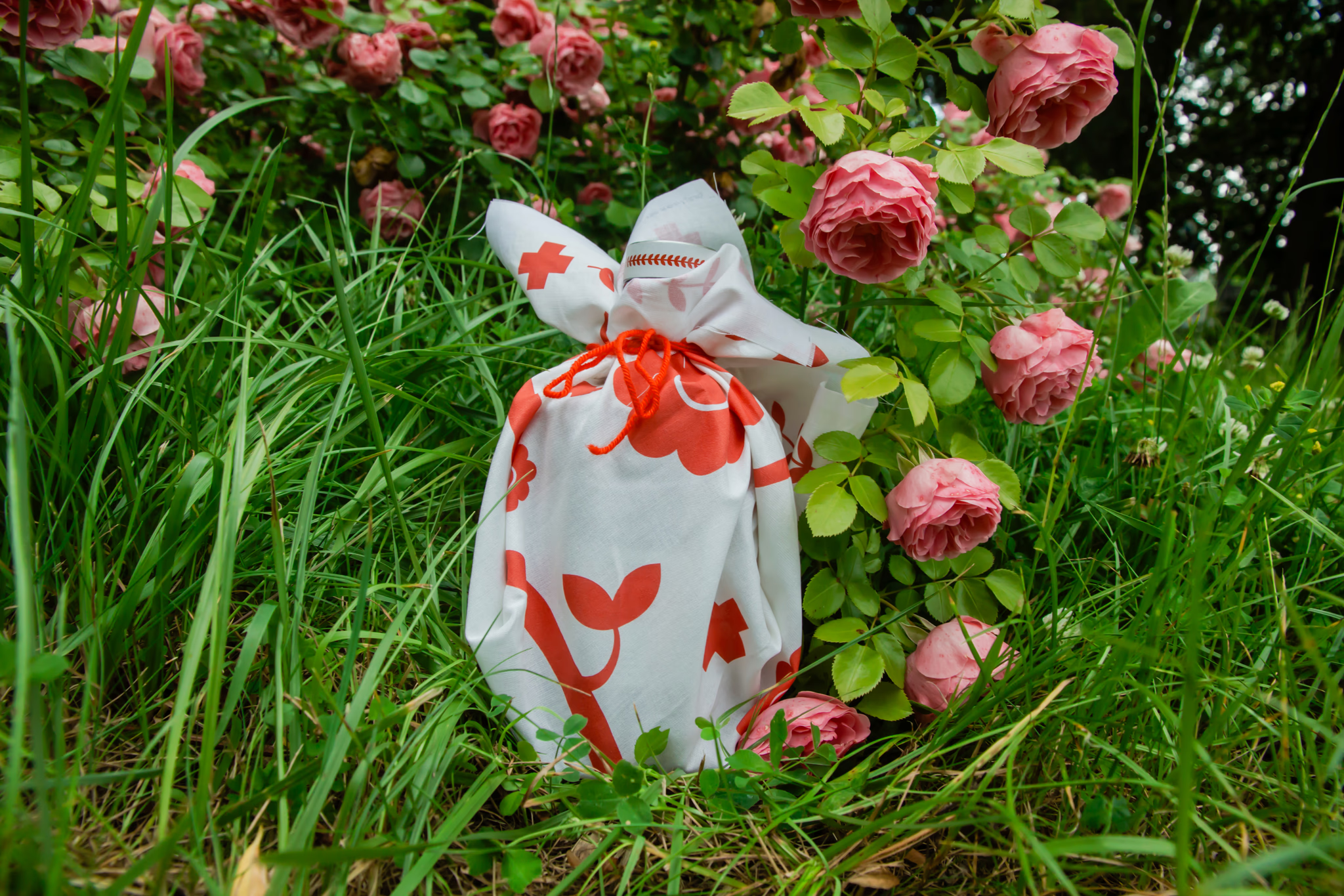
The concept builds a single graphic system from the region’s embroidery motif and the apothecary cross — a nod to the folk belief in the liqueur’s medicinal power. The cross-and-flower pattern repeats across the fabric cap wrap, the back label border, and the front label framing, carrying one visual language across every material.
Result:
The project was submitted to Art of Packaging in Poznań, Poland’s national packaging design competition, in the Debiuty (student) category judged by an independent jury of packaging industry professionals.